This page serves as a reference of the Markdoc tags used in XRPL documentation. These extensions of Markdown syntax allow for stylized and dynamic contents.
When using self-closing tags, be sure to include the closing slash in the tag definition. Otherwise, content after the unclosed tag will not be displayed.
This section describes the Redocly built-in tags that XRPL documentation uses most often and the conventions for using them in the site.
Show text in a colored box that stands out from regular paragraphs, sometimes referred to as a callout. There are four levels of admonition with escalating levels of severity. You can put any text in the name attribute, but there are recommended names for each category that can be automatically translated. For historical reasons, the recommended names do not align cleanly with the type options. The recommended names are:
type | Color | Recommended name | Usage |
|---|---|---|---|
success | Green | Tip | Optional, additional information, shortcuts, and cases where people might think there's a problem but there actually isn't. |
info | Blue | Note | Quirks, background information, or other details that are not critical but may be good to know. |
warning | Yellow/Orange | Caution | Common mistakes, misunderstandings, or limitations that may cause confusion and inconvenience. |
danger | Red/Magenta | Warning | Mistakes or risks that may cause financial loss, security incidents, or other substantial problems. |
Example usage:
{% admonition type="success" name="Tip" %}
Admonitions create colored boxes that stand out from regular paragraphs.
{% /admonition %}
Demonstration:
Admonitions create colored boxes that stand out from regular paragraphs.
It is valid to put an admonition's opening and closing tags all on the same line as its contents. To avoid a Redocly bug, make sure multi-line admonitions have their opening and closing tags on separate lines.
Include an image in SVG format inline in the page's markup. This allows the diagram's color scheme to adapt to the user's current (light/dark) theme. Typically, you should use the tag inside a link that opens the SVG file as a stand-alone image so the user can view it and zoom in or out as needed. For tips on making diagrams compatible with this feature, see Creating Diagrams. This tag is self-closing.
Example usage:
[{% inline-svg file="/docs/img/anatomy-of-a-ledger-simplified.svg" /%}](/docs/img/anatomy-of-a-ledger-simplified.svg "Figure 1: Anatomy of a ledger version, which includes transactions, state, and metadata")
Demonstration:
Include text from another, reusable file, called a snippet. Unlike environment variables, partials are typically an entire paragraph or more. If text needs to be updated in multiple places, you can use this component to reuse a single file's contents in multiple places. Store the source file in the docs/_snippets/ directory. This tag is self-closing.
Example usage:
{% partial file="/docs/_snippets/secret-key-warning.md" /%}
Demonstration:
自分が管理していないサーバに秘密鍵を送信しないでください。暗号化されていない秘密鍵をネットワーク経由で送信しないでください。
Links and markup inside snippets are parsed separately before being added to the including file. Relative links are resolved based on the location of the snippet, not on the file including it. To include a snippet that resolves its contents in the context of the including page instead, include the file as a raw partial instead. This is useful when you want the partial to refer to the name of the page that included it, or if it defines common links used throughout the site.
Example usage:
{% raw-partial file="/docs/_snippets/tx-fields-intro.md" /%}
Include the contents of a predefined variable, inline in the document. Unlike partials, these are typically only a few words at most. Common use cases include {% $frontmatter.seo.title %} for referring to the title of the current page (used in some templates and snippets), and environment variables for the current reserve amounts on the XRP Ledger Mainnet.
Example usage:
Each NFToken page requires a reserve of {% $env.PUBLIC_OWNER_RESERVE %}.
Demonstration:
Each NFToken page requires a reserve of 0.2 XRP.
/%}).Markdown supports creating custom tags with user-defined functionality. This repository defines several such tags for convenience in editing, as follows.
Show a disclaimer that functionality is based on an amendment to the XRP Ledger protocol, which updates live with the status of the amendment on Mainnet. The name parameter is required and is case-sensitive. This tag is self-closing.
Example usage:
{% amendment-disclaimer name="Credentials" /%}
Demonstration:
Credentials amendmentが必要です。 Loading...
When the amendment is not enabled on Mainnet, the component adds a paragraph that says, "Requires the (name) amendment," with a badge showing the amendment's voting percentage. After the amendment is enabled, the paragraph changes to say, "Added by the (name) amendment," with a badge showing the date the amendment became enabled.
The compact=true parameter (note, it is an error to put true in quotation marks here) displays only the name of the amendment and the status badge.
The mode="updated" parameter (case-sensitive) changes the paragraph so that it says, "The (name) amendment updates this," before the amendment is enabled, and "Updated by the (name) amendment," afterward, with the same badges.
Show a colored inline badge. Use these to point out new or updated features, especially in the API, that are not tied to an amendment. The contents are the text of the badge; the left and right halves are split by the : character in the text.
Example usage:
{% badge href="https://github.com/XRPLF/clio/releases/tag/2.0.0" date="February 18, 2024" %}New in: Clio 2.0.0{% /badge %}
Demonstration:
The date parameter is optional, and is not displayed. It is helpful to remind editors when a change is old enough to remove the badge.
When updating a feature, replace New in: with Updated in:. These and certain other phrases automatically set the color of the badge and can be automatically translated. If necessary, you can add a color parameter such as color="purple" to the tag to set the color explicitly.
Create a grid of cards with specific links and icons. By default, the grid is 3 cards wide on desktop and 1 card wide on mobile. The contents of the card grid should only be xrpl-card tags. The xrpl-card tag is self-closing.
Example usage:
{% card-grid %}
{% xrpl-card title="Javascript" body="Using the xrpl.js client library." href="/docs/tutorials/javascript/" image="/img/logos/javascript.svg" imageAlt="Javascript logo" /%}
{% xrpl-card title="Python" body="Using xrpl.py, a pure Python library." href="/docs/tutorials/python/" image="/img/logos/python.svg" imageAlt="Python logo" /%}
{% /card-grid %}
Demonstration:


Show a bulleted list of pages that are children of the page using this tag. The descriptions of the pages use the frontmatter's seo.description field. This tag is self-closing and takes no parameters.
Example usage:
{% child-pages /%}
This tag only works if you include the following data in the page's frontmatter:
metadata:
indexPage: trueDisplay a yellow flask icon with a tooltip about how the feature is not available on the production XRP Ledger. Usually, you should use an amendment-disclaimer instead, but there may be edge cases where you want to include this icon. This tag is self-closing and takes no parameters.
Example usage:
{% not-enabled /%}
Demonstration:
Link to a particular file in the source code repository for this site, usually a code sample. If you are working from a fork or branch of the site, all such links can be updated at once with a site configuration change. The contents are the text of the link.
Example usage:
{% repo-link path="_code-samples/build-a-desktop-wallet/js/1_ledger-index.js" %}`1-ledger-index/index.js`{% /repo-link %}
Demonstration:
Display a different graphic depending on if the site is being viewed in "mobile" or "desktop" style. The graphic is also a link to the desktop version of the graphic, which is usually the larger version, so that the user can view the enlarged version. Provide the (absolute, from repo top) path to the desktop graphic in the desktop attribute, mobile graphic in the mobile attribute, and alt text in the alt attribute. All three attributes are required.
Example usage:
{% responsive-graphic desktop="/docs/img/nft-brokered-mode-with-reserve.svg" mobile="/docs/img/nft-brokered-mode-with-reserve.mobile.svg" alt="Brokered mode with reserve: the seller mints and lists the NFT at a minimum price, buyers bid, and the broker matches the sale, takes a fee, and cancels remaining bids." /%}
Link to an xrpld source code file. The link is built using a path parameter and PUBLIC_XRPLD_RELEASE variable in this repository's .env file. If an optional name parameter is provided, the link is styled differently.
Example usage without name:
{% source-link path="src/libxrpl/tx/transactors/account/AccountDelete.cpp" /%}
Demonstration:
[Source]Example usage with name:
{% source-link name="AccountDelete" path="src/libxrpl/tx/transactors/account/AccountDelete.cpp" /%}
Demonstration:
This is a plain link to the AccountDelete source code.
Link to the WebSocket tool as a button. The text of the button is normally "Try it!" in English, and can be translated by setting the component.tryit key in the localization's translations.yaml file. This tag is self-closing.
Example usage:
{% try-it method="account_currencies" server="testnet" /%}
Demonstration:
試してみるThis tag takes the following parameters:
| Parameter | Required? | Description |
|---|---|---|
method | Yes | The ID of the anchor to use on the WebSocket Tool page. For most WebSocket API methods, this is the API method exactly, but it could contain more. For example, different ledger_entry variations use a suffix like ledger_entry-nft-page. If you are documenting a new method, you must also add that method to the WebSocket tool by editing /resources/dev-tools/components/websocket-api/data/command-list.json. |
server | No | A specific server to use for the request. You may want to specify the server if a method is specific to Clio or rippled servers, or if the example uses data or amendments that are only on a specific test network. |
The values you can provide to the server parameter are as follows:
server value | Server to use |
|---|---|
| (Omitted) | The WebSocket tool's default server (currently s1.ripple.com) |
s1 | Ripple's s1.ripple.com Mainnet public cluster, typically served by Clio servers. |
s2 | Ripple's s2.ripple.com Mainnet full-history public cluster, typically served by Clio servers. |
xrplcluster | The xrplcluster.com cluster of public servers, typically served by rippled servers with a lightweight proxy in front. |
devnet | The s.altnet.rippletest.net cluster of Testnet servers. |
testnet | The s.devnet.rippletest.net cluster of Devnet servers. |
Display a group of transaction types in a rich table. This tag is only intended for use in the Transaction Type Reference. Example usage:
{% tx-category name="Payments" /%}
Screenshot of example output: 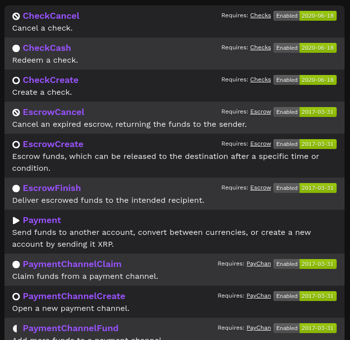
This tag requires the following parameter:
| Parameter | Required? | Description |
|---|---|---|
name | Yes | Display transaction types whose labels include this one (case-sensitive). |
This tag requires specific metadata to work correctly. First, the transaction types landing needs to be marked as an index page in its own frontmatter, since this relies on the same plugin as the Child Pages tag:
metadata:
    indexPage: true
Then, each transaction type page needs the following frontmatter fields:
| Field | Description |
|---|---|
labels | A list of label strings for the transaction type; to appear on the transaction index page, it should include at least one label named by a tx-category tag on the transaction index page. You can provide extra labels but they are not currently used. To ensure consistency when some pages are translated and some aren't yet, use the English-language labels even in translated files. (The labels currently don't display directly to the user, but if they ever do, we can use translation keys to ensure the appropriately localized version displays.) Labels are case-sensitive. A page can be listed by multiple tx-category markdoc tags if it has labels matching each of them. |
requiredAmendment | If provided, must be the name of an amendment that is required for this transaction. Causes tx-category to display an amendment status badge in the row for this page, representing the status of the amendment on Mainnet. |
txIcon | Control which icon displays next to the transaction type name in the table. Valid options are create, modify, cancel, finish, send, and other (case-insensitive). If omitted, use the other icon. Choose the icon that best represents the type of action this transaction typically does. |
Frontmatter fields are technically always optional, but it's strongly recommended to provide these for each transaction type page, so that the transaction type displays correctly on the transaction reference.
If any of these fields are omitted, or contain a typo, this typically results in the field being ignored, with no error message. This can cause a transaction type to be omitted from the landing page, display the default "other" icon, or not display the amendment status badge.
Link to the WebSocket tool, as a button, with a body pre-filled to look up a specific example transaction. The text of the button is normally "Query example transaction" in English, and can be translated by setting the component.queryexampletx key in the localization's translations.yaml file. This tag is self-closing.
Example usage:
{% tx-example txid="1AF19BF9717DA0B05A3BFC5007873E7743BA54C0311CCCCC60776AAEAC5C4635" /%}
Demonstration:
トランザクションの例を確認This tag takes the following parameters:
| Parameter | Required? | Description |
|---|---|---|
txid | Yes | The unique hash of the transaction to look up. |
server | No | A specific server to use for the request. Possible values are the same as {% try-it %} as defined above. For example, you may need to specify devnet to show a transaction added by an amendment that isn't enabled on Mainnet. |
Display a legend of the icons used by the Tx Category tables.
Example usage:
{% tx-icon-legend /%}
Demonstration:
Icon Legend
 create
 modify
 finish
 cancel
 send
send other
other