




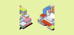


A section pattern with a header (heading + description) and a grid of CardTextIconCard components.
CardsIconGrid mirrors the LinkTextDirectory header structure and renders cards in a responsive grid using PageGrid.Row as="ul" and CardTextIconCard with gridColSpan. Each card is a PageGrid.Col as="li"—no div wrapper.
- Header with heading and optional description
- Responsive grid: 3 cards/row at all breakpoints (base, md, lg)
- Aspect ratios: sm 3:2, md/lg 4:3
- Light/dark mode support
import { CardsIconGrid } from 'shared/sections/CardsIconGrid';

<CardsIconGrid
  heading="Explore Tools"
  description="Choose a tool to get started"
  cards={[
    {
      icon: "/icons/docs.svg",
      iconAlt: "Documentation",
      heading: "Documentation",
      description: "Access everything you need.",
    },
  ]}
/>| Prop | Type | Description |
|---|---|---|
heading | string | Section heading |
description | string | Optional description |
cards | CardTextIconCardData[] | Array of card configs |
className | string | Additional CSS classes |
- base: 4, md: 4, lg: 4 (3 cards per row)
CardsIconGrid.tsx- React componentCardsIconGrid.scss- Stylesindex.ts- Barrel exportsREADME.md- This file